Blended Axes
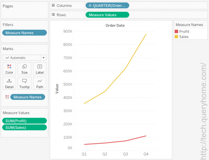
Measures can share a single axis so that all the marks are shown in a single pane. Instead of adding rows and columns to the view, when you blend measures there is a single row or column and all of the values for each measure is shown along one continuous axis. For example, the view below shows quarterly sales and profit on a shared axis.

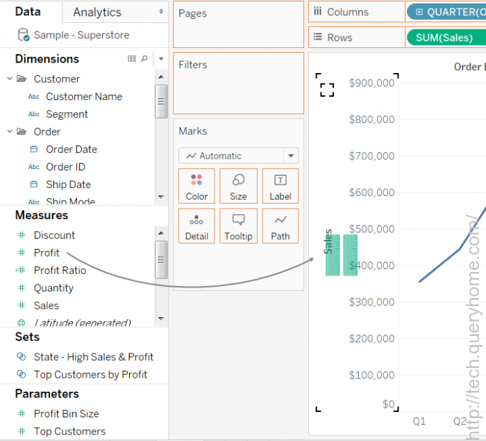
To create this view and blend multiple measures, simply drag one measure or axis and drop it onto an existing axis.
Note: If you drag a measure on to the canvas and only see a single ruler indicator instead of the double ruler indicator shown below, Tableau creates dual axes instead of a blended axis. For more information about how to create dual axes, see Dual Axes.

Blending measures uses the Measure Names and Measure Values fields, which are generated fields that contain all of the measure names in your data source and all of the measure values. The shared axis is created using the Measure Values field. The Measure Names field is added to Color on the Marks card so that a line is drawn for each measure. Finally, the Measure Names field is filtered to only include the measures you want to blend.
Note: Blending axes is most appropriate when comparing measures that have a similar scale and units. If the scales of the two measures are drastically different, the trends may be distorted.
