The previous part of this series dealt with event handling mechanism of jQuery. In this part I cover how to add jazz to your web forms using jQuery effects. jQuery provides a set of methods that allow you to create animations in your web pages. Collectively these methods are called as Effects. The effects they render include fading in and out, sliding in and out, changing opacity of elements, hiding and showing elements and so on. You can, of course, define custom animations. The following table lists some of the important effect methods :
| Method | Description |
| show | Shows selected elements. If duration parameter is specified then it animates width, height and opacity simultaneously. |
| hide | Hides selected elements. If duration parameter is specified then it animates width, height and opacity simultaneously. |
| fadeIn | Adds fade-in effect to selected elements. Opacity is increased from lower to higher value. |
| fadeOut | Adds fade-out effect to selected elements. Opacity is decreased from higher to lower value. |
| slideDown | Adds slide-down effect to selected elements. Height is increased from lower to higher value. |
| slideUp | Adds slide-up effect to selected elements. Height is decreased from higher to lower value. |
| animate | Allows to define a custom animation. |
| delay | Introduces a delay between two effects. |
| stop | Stops the currently running animation. |
To understand how jQuery effects work we will develop three examples.
Animated Tooltips
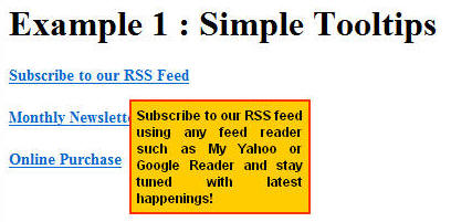
The first one will be a simple tooltip as shown below :

Here, we have few link buttons. When you hover your mouse pointer onto some link a tooltip pops up in animated fashion. This example makes use of show() and hide() methods.
The web form consists of three LinkButton controls and three Panel controls. The following markup shows these controls :
<div id="example1">
<asp:LinkButton ID="LinkButton1" runat="server" Font-Bold="True"
    Font-Size="14px">Subscribe to our RSS Feed</asp:LinkButton>
<br />
<br />
<asp:LinkButton ID="LinkButton2" runat="server" Font-Bold="True"
    Font-Size="14px">Monthly Newsletter</asp:LinkButton>
<br />
<br />
<asp:LinkButton ID="LinkButton3" runat="server" Font-Bold="True"
    Font-Size="14px">Online Purchase</asp:LinkButton>
<br />
<asp:Panel ID="tooltipLinkButton1" runat="server">
    Subscribe to our RSS feed using any feed reader such as My Yahoo or Google
    Reader and stay tuned with latest happenings!
</asp:Panel>
<asp:Panel ID="tooltipLinkButton2" runat="server">
    Subscribe to our monthly newsletter and get news, announcements, tips and tricks
    directly in your inbox!
</asp:Panel>
<asp:Panel ID="tooltipLinkButton3" runat="server">
    Purchase our books, DVDs and other accessories through our secure payment
    processing system!
</asp:Panel>
</div>
The look and feel of Panel controls is taken care by a CSS class named Tooltip.
.Tooltip
{
    border:solid 2px #FF3300;
    background-color:#FFCC00;
    padding:5px;
    position:absolute;
    font-family:Arial;
    font-size:12px;
    font-weight:bold;
    text-align:justify;
    width:150px;
}
The jQuery code that actually displays the tooltips is shown below :
$(document).ready(OnReady);

function OnReady() {
    $("#example1 div").addClass("Tooltip")
                      .hide();
    $("#example1 a").hover(OnMouseOver, OnMouseOut);
}

function OnMouseOver(event) {
    var id = event.target.id;
    $("#example1 div[id $='" + id + "']").css("left", event.pageX + 15)
                               .css("top", event.pageY + 15)
                               .show(500);
}

function OnMouseOut(event) {
    var id = event.target.id;
    $("#example1 div[id $='" + id + "']").hide(500);
}
When the page is loaded we hide all the Panel controls (DIV elements) using hide() method. When you use hide() method without any parameter it essentially sets "display" CSS property to "none". We then handle hover event of all LinkButton controls (A elements). In the OnMouseOver() function we first get hold of DIV associated with that link. Notice that we have assigned IDs of Panel controls such that they contain associated LinkButton IDs. This way it is easier for us to detect a Panel corresponding to a LinkButton. We then set left and top properties of the Panel to pageX and pageY coordinates. The show() method displays the Panel. If show() method is used without any duration parameter then the underlying element is shown without any animation. Specifying duration parameter (500 in above example) means that show() method should show the element with animated height, width and opacity. The duration is in milliseconds. Lower the duration higher the animation speed and vice a versa. So duration parameter is essentially tells "show me this animation for n milliseconds".
The OnMouseOut() function calls hide() method on the previously shown Panel. This time hide() method has duration parameter specified indicating the speed of animation.
There are inbuilt string constants "fast" and "slow" that represent 200 and 600 milliseconds respectively. We can use these strings with show() and hide() methods instead of specifying milliseconds as number.
Master-details
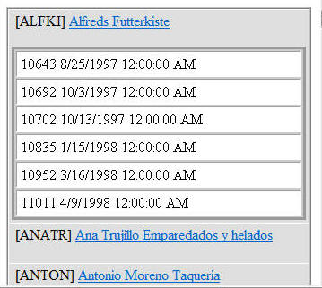
The next example consists of a master-details kind of web form wherein there are two DataList controls. The outer DataList displays Customer records (master) and the inner DataList displays Orders by a customer (details). The web form looks like this :

The CompanyName column is displayed as a LinkButton. When you click on the CompanyName link all the orders by that customer are displayed with animation effect. If you click on the link again orders are hidden with animation effect. The jQuery code that makes it work is as follows :
$(document).ready(OnReady);

function OnReady() {
    $("div[id $= 'orders']").css("display", "none");
    $("a[id $= 'lnkCompanyName']").click({animationType:'custom'},ShowOrders);
}

function ShowOrders(event) {
    switch (event.data.animationType) {
        case "simple":
            if ($("#" + event.target.id + " ~ div").is(":visible")) {
                $("#" + event.target.id + " ~ div").hide(1000);
            }
            else {
                $("#" + event.target.id + " ~ div").show(1000);
            }
            break;
        case "fade":
            if ($("#" + event.target.id + " ~ div").is(":visible")) {
                $("#" + event.target.id + " ~ div").fadeOut(2000);
            }
            else {
                $("#" + event.target.id + " ~ div").fadeIn(2000);
            }
            break;
        case "slide":
            if ($("#" + event.target.id + " ~ div").is(":visible")) {
                $("#" + event.target.id + " ~ div").slideUp(1000);
            }
            else {
                $("#" + event.target.id + " ~ div").slideDown(1000);
            }
            break;
        case "custom":
            $("#" + event.target.id + " ~ div").animate({
                    opacity: 'toggle',
                    width: 'toggle',
                    height: 'toggle'
                  }, 2000, function() {});
            break;
    }
    event.preventDefault();
}
The ready event handler attaches a click event handler for all the CompanyName links. Notice how we use $= (ends with) operator to select LinkButtons. We need to use $= operator because LinkButtons are inside DataList1 and their client side ID after rendering in the browser will be something like DataList1_ctl01_lnkCompanyName. While attaching the event handler we pass animationType as custom event data. This way we can easily change the type of animation (slide-down, fade-in etc.).
The ShowOrder() event handler function checks the value of animationType passed and accordingly calls appropriate animation methods. Methods of our interest, in this example, are slideDown(), slideUp(), fadeIn(), fadeOut() and animate(). All of these methods except animate() are very identical in terms of usage syntax. They accept duration parameter and animate the selected elements for that much duration of time. You can see all of them in action by changing the animationType.
The animate() method needs special attention. The animate() method accepts animation settings, duration of animation and a callback function to be called once the animation has run. Using the animation settings parameter you can specify height, width and opacity values. The "toggle" string literal used in the above example simply changes their values from lower to higher and higher to lower. Some other examples of using animation settings parameter are as follows :
{width: '+=50'}
{height: '200'}
{height: '+=20', width: '200'}
The above example doesn't use callback function.
Progress Indicator
In this final example of this article we will develop a progress indicator that visually notifies the user that some processing is going on. Our progress indicator will look similar to a progress bar but with to and fro movement.

Clicking on Start button starts the progress indicator and clicking on Stop button stops the animation. The progress indicator is actually a series of DIV elements as shown below :
    <div id="container" class="container">
        <div id="block" class="block">
        <div id="block5" class="block5"></div>
        <div id="block4" class="block4"></div>
        <div id="block3" class="block3"></div>
        <div id="block2" class="block2"></div>
        <div id="block1" class="block1"></div>
        </div>
    </div>
The outermost DIV (the boundary of progress indicator bar) has ID container. Inside there are five DIVs with 10px height and width. Their opacity is set in such a way that together they give that fading look. The CSS classes used in the above markup are as follows :
.block
{
    width:50px;
    position:absolute;
    display:none;
}
.block1
{
    width:10px;
    height:10px;
    background-color:Navy;
    opacity:1;
    float:left;
}
.block2
{
    width:10px;
    height:10px;
    background-color:Navy;
    opacity:0.7;
    float:left;
}
.block3
{
    width:10px;
    height:10px;
    background-color:Navy;
    opacity:0.5;
    float:left;
}
.block4
{
    width:10px;
    height:10px;
    background-color:Navy;
    opacity:0.3;
    float:left;
}
.block5
{
    width:10px;
    height:10px;
    background-color:Navy;
    opacity:0.1;
    float:left;
}
.container
{
    width:200px;
    height:10px;
    border:solid 1px silver;
}
Initially DIV with ID "block" is hidden (display : none). When the page is loaded we attach event handlers to the Start and Stop buttons.
$(document).ready(OnReady);

function OnReady() {
    $("#start").click(function(event) { flag = true; ShowProgressIndicator(0);
      event.preventDefault(); });
    $("#stop").click(function(event) { flag = false;
      event.preventDefault(); });
}
The click event of start button sets a global JavaScript variable flag to true and then calls ShowProgressIndicator() function by passing 0 as its parameter. The ShowProgressIndicator() function will be discussed shortly. The click event handler of Stop button sets the flag variable to false. As you might have guessed, the flag variable determines whether to continue the animation or not.
function ShowProgressIndicator(dir) {
    $("#block").show();
    if (dir == 0) {
        $("#block").animate({ left: '160' }, 5000, OnAnimationComplete);
    }
    else {
        $("#block").animate({ left: '10' }, 5000, OnAnimationComplete);
    }
}
The ShowProgressIndicator() function takes direction of movement (0 - left to right 1 - right to left) as parameter and shows the five DIVs that make the moving part of the indicator. Depending on the direction it calls animate() method on the block. If we are moving from left to right then we pass maximum left coordinate as 160. The outermost DIV has width 200px so here we pass 160px. If you change the width of outermost DIV then change 160 to whatever new value. Passing left as 160 and duration as 5000 means "move the block till its left coordinate is 160px in 5 seconds". Similarly while moving in the reverse direction we pass left coordinate as 10. The OnAnimationComplete function is a callback function that is triggered at the end of animation (i.e. after 5000 milliseconds).
function OnAnimationComplete() {
    $("#block > div").each(function(index) {
        if ($(this).hasClass("block1")) {
            $(this).removeClass();
            $(this).addClass("block5");
        }
        else if ($(this).hasClass("block2")) {
            $(this).removeClass();
            $(this).addClass("block4");
        }
        else if ($(this).hasClass("block3")) {
            $(this).removeClass();
            $(this).addClass("block3");
        }
        else if ($(this).hasClass("block4")) {
            $(this).removeClass();
            $(this).addClass("block2");
        }
        else if ($(this).hasClass("block5")) {
            $(this).removeClass();
            $(this).addClass("block1");
        }
    });
    if (flag == true) {
        if ($("#block1").hasClass("block1")) {
            ShowProgressIndicator(0);
        }
        else {
            ShowProgressIndicator(1);
        }

    }
    else {
        $("#block").hide();
    }
}
The OnAnimationComplete() function essentially toggles the CSS classes of the five DIVs that make the moving block of the indicator. It does so by using hasClass() method. The hasClass() method returns true if the specified class is applied to the element. This way the opacity values while moving from left to right are 0.1, 0.3, 0.5, 0.7, 1.0 and while moving from right to left are 1.0, 0.7, 0.5, 0.3, 0.1. In effect we feel as if DIVs has reversed their positions.
Then we check the global flag variable to determine whether to continue the animation or not. If the flag is true then we run the animation again by calling ShowProgressIndicator() method. Otherwise the animation ends and the block is hidden.
I hope you enjoyed the animation effects of jQuery. In the next part I will discuss about making AJAX calls from jQuery to ASP.NET web services, page methods and WCF services. Stay tuned!


