When we are starting a new project, we need to take great care of everything to project the kind of image that we want: everything can make a difference. We will find ourselves worrying a lot about all sort of things that used to have little to no importance to us: the colors, the formatting of the writing, the wording we are using, the font... and oftentimes, we don't know enough about these things to make a good, informed choice right away. What are even the differences between fonts? Is there something in particular that categorizes them?
Before you scroll through hundreds and hundreds of sites with hundreds and hundreds of different fonts searching for a serif fonts download, let us make the job easier for you: yes, there is a way to categorize fonts so don't worry. Fonts are usually categorized into 4 types: serif, sans serif, script and slab, each with its particular characteristics (serif is more old-timey, with some adornments at the ends of the letters, sans serif is very cold and professional with no adornments at all, script is round and cute, and it imitates human handwriting and slab is thick and heavy, and it might come across as very aggressive). So now that you know the differences between the categories of fonts, we are going to concentrate in distinguishing two of the most popular typefaces (which is how font types are called), serif and sans serif.
Serif is a much older typeface, and it has been used pretty much since the origin of the printing press. This very old-timey, classy, elegant font gives off a timeless feeling, and it is probably associated with books, novels, and textbooks in your mind, as most of the things written in the paper are still written using mainly serif typefaces. Some serif fonts are Baskerville (of course, taken from the famous book), Calluna, DejaVu Serif... among many others.
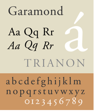
 This typeface is usually really easy to read and comfortable for the eyes: the highly symmetrical letters, the adornments and the sleekness of the weight of the letters really pull the eyes forward and allow us to read with comfort and ease, without tired your eyes. This elegant typeface is great for those that are looking to write a book, a newspaper, an essay or anything that shall be printed on paper; but also for those that are going to create digital or online projects that should be easy to read due to their length or topic (for example, long articles in websites that explain topics that should be understandable to an audience such as medical topics). There are also some fonts that, due to their particularities, are really easy to read for people with dyslexia or issues in their eyes. Such fonts are called "readable fonts", and some serif readable fonts are Garamond, Century or Bodoni.
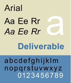
On the other hand, we have sans serif, which was created as a variation of the serif typeface that was supposed to be more easy to read and more cheap to produce, since thanks to the symmetry of the letters and the lack of adornments it could fit many more words in a page. However, due to the way it has evolved, some people find it less comfortable to read. It is mainly used for digital projects like websites, forums, online newspapers... and if you are on the Internet on the regular, you have probably heard of some sans serif fonts like Verdana or Arial.
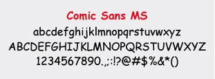
This highly symmetrical, no-nonsense, the condensed font is much more straightforward, and while it might be more challenging to read for some, it facilitates things for others. It gives off a very professional, cold, no-feelings-involved feelings and as such is great for serious projects versing about stuff where feelings can't be involved: newspapers, articles and websites about business (or, since sans serif is a widely used typeface when it comes to computers, it is a great option for any kind of digital project). Some readable sans serif fonts are the widely shunned comic sans or Helvetica.

We hope this article has taught you a bit about what are the differences between this typefaces and therefore made it easier for you to choose what kind of font you would like to use for your project. If you want to learn more about fonts, head to fontsly for some free serif fonts downloads!
